Optimizing Affiliates Management app
Optimizing Affiliates
Management app
Optimizing Affiliates Management app
PRODUCT DESIGN
PRM
About NTTool
The Affiliates Management App (NTTool) was an internal CRM used by affiliate managers to run partnerships across multiple brands, including CyberGhost, Private Internet Access, and Intego Antivirus. It connected campaign data, landing pages, and financial transactions, making it one of the most important tools for paid user acquisition.
Over time, operational changes and new security requirements exposed critical usability issues. The tool no longer matched team workflows, created unnecessary support overhead, and slowed down daily decision-making.

TL;DR
Goal:
Redesign the Affiliates Management App to reduce workflow friction, improve usability across multiple brands, and comply with new cybersecurity requirements.
Key problems:
Repeated logins required when switching brands
No in-app password recovery; every reset required an IT ticket via Slack
Mandatory 2FA requirement from cybersecurity team needed integration
Cluttered dashboards with no filtering, sorting, or bulk actions
Result:
IT support tickets for password resets reduced by an estimated 80-85%
Brand switching no longer requires logout and re-authentication
Landing page mapping errors dropped from roughly 15% to under 5%
Onboarding time cut from 3 weeks to under 2 weeks
Positive usability feedback in team reviews
100% user preference for dark mode in team survey
Role:
UX/UI lead. Conducted user research, mapped critical workflows, redesigned login and dashboard experience, unified visual system, and collaborated with product, dev, and security teams for rollout.
What shipped:
Unified login with in-app brand filter
Built-in password recovery and integrated 2FA
Simplified data hierarchy with filtering, sorting, and pagination
Unified dark/light mode color system
Timeline:
4 weeks (2 weeks research and design, 2 weeks testing and iteration)
Project Goal
The Affiliates Management App was the central platform for managing partnerships across CyberGhost, Private Internet Access, ExpressVPN, and Intego Antivirus.
It connected campaigns, landing pages, and financial data, making it one of the most important tools in the company's subscriber acquisition strategy.
With operational changes and stricter IT policies, the tool no longer supported managers effectively. Switching brands required repeated logins, password resets depended on IT support via Slack, dashboards were cluttered with no way to filter or sort data, and mandatory 2FA needed to be integrated without adding friction. The goal was to streamline core workflows, unify the visual system, and integrate security requirements without slowing down daily work.
Research Approach
To understand where the tool failed, I conducted interviews with six affiliate managers across CyberGhost, Private Internet Access, and ExpressVPN. Each test group included one senior manager with three or more years of experience and one junior with less than a year in the role. Sessions focused on everyday tasks: logging in, switching brands, creating new affiliate links, and reconciling payouts.
I also reviewed technical constraints with the product and cybersecurity teams. Mandatory 2FA had to be integrated, password reset needed to align with existing IT systems, and mobile access was restricted by policy. This combination of user feedback and system requirements gave me a clear picture of pain points and the boundaries for viable solutions.
Identified Design Pain Points
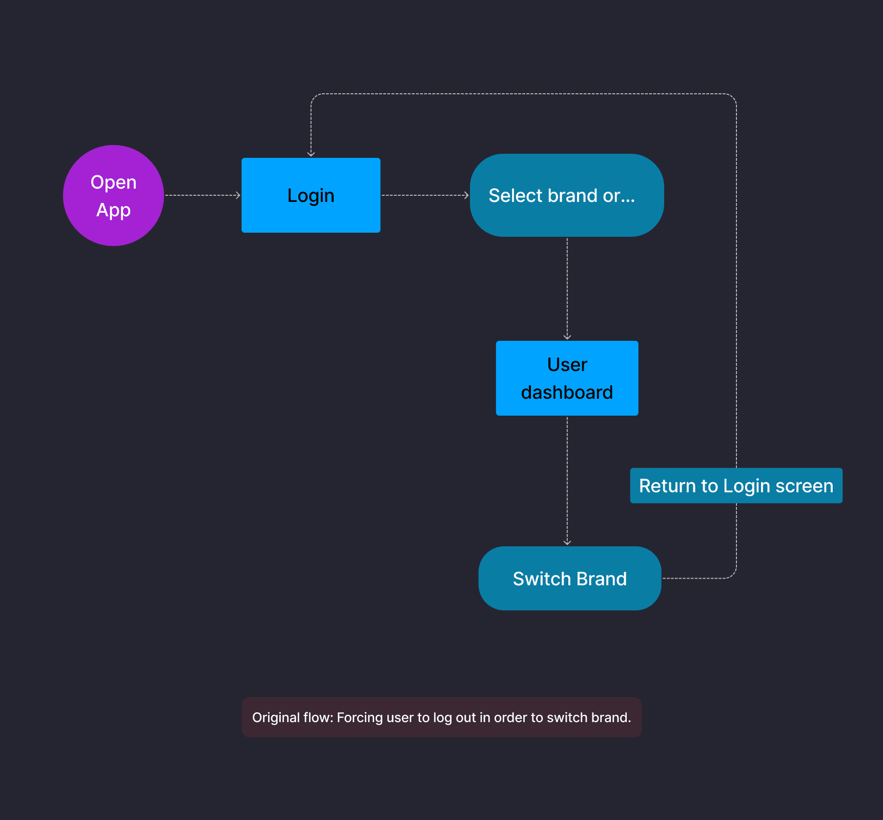
Brand switching required logout and re-login
Managers had to log out and log back in every time they switched between brands. This repetitive step slowed down daily work and made multi-brand management inefficient. The original flow forced users through the full login process just to view data from a different brand.
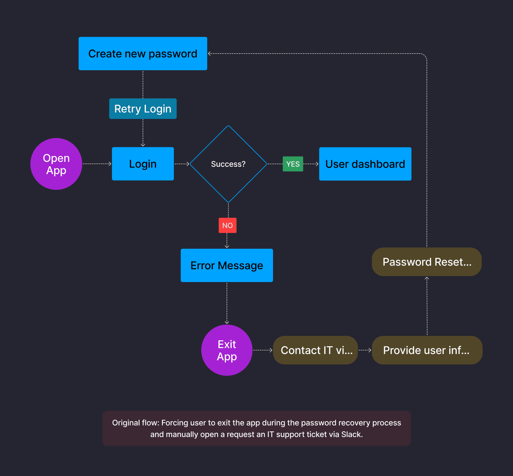
Password resets required IT support tickets
With no in-app recovery flow, every password reset required exiting the app, contacting IT via Slack, providing user information, and waiting for a reset link. This process was disruptive for managers and created unnecessary load for IT, especially during mandatory password change cycles.
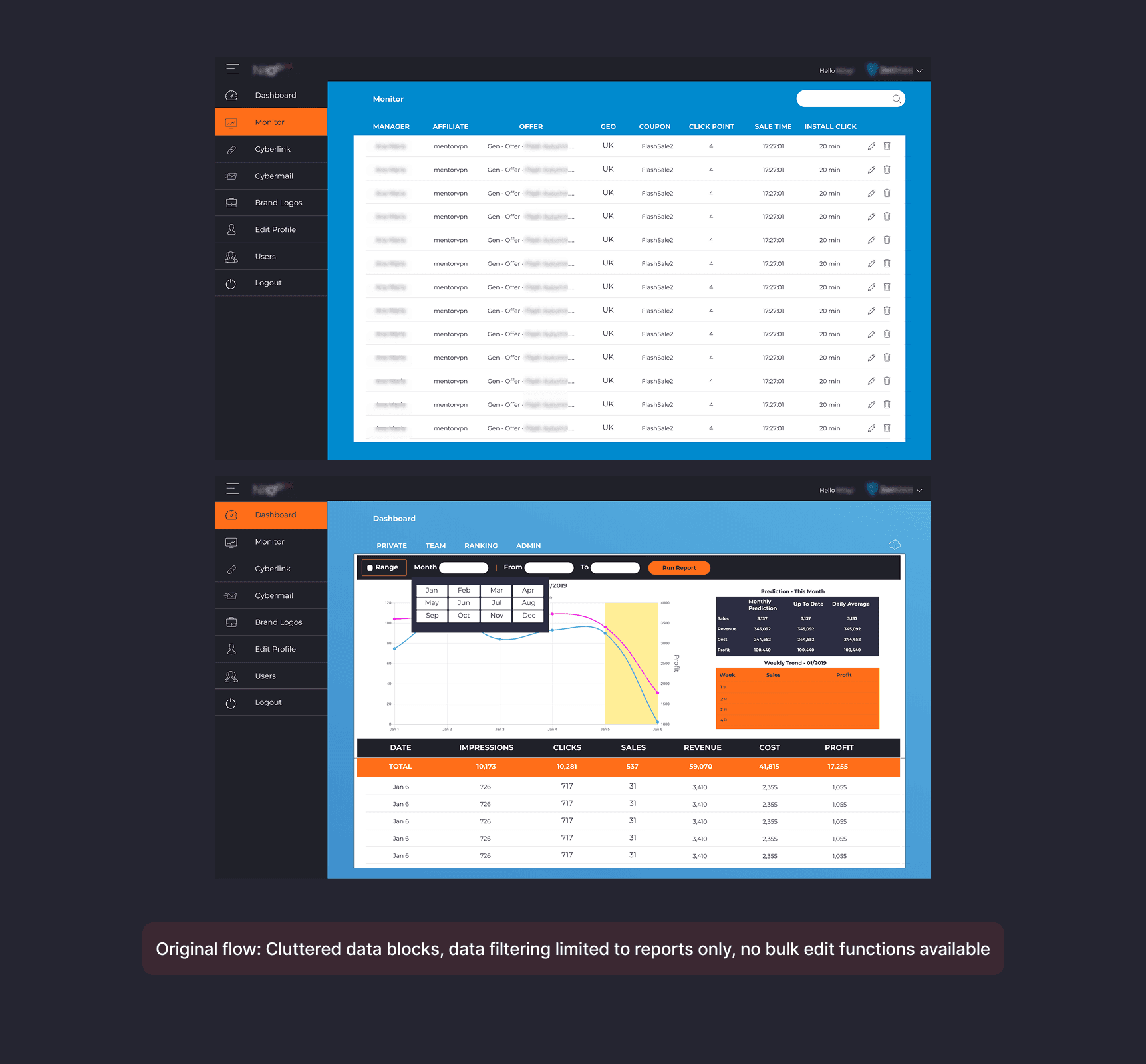
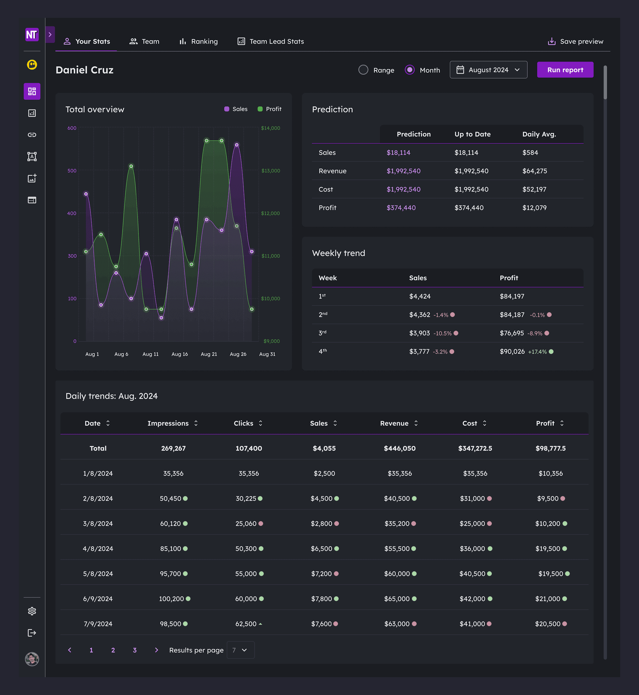
Dashboards were cluttered and hard to use
Financial and performance data was presented in dense blocks with no sorting, filtering, or bulk edit functions. Managers often made errors when adding or editing data, and extracting insights required exporting to spreadsheets.
Dashboards were cluttered and hard to use
Financial and performance data was presented in dense blocks with no sorting, filtering, or bulk edit functions. Managers often made errors when adding or editing data, and extracting insights required exporting to spreadsheets.
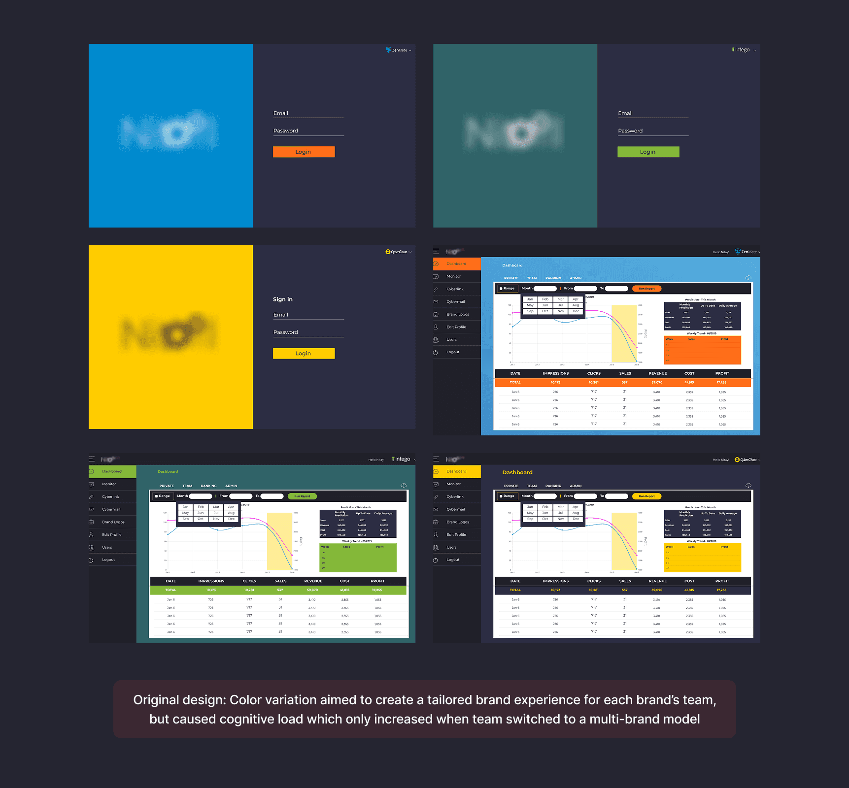
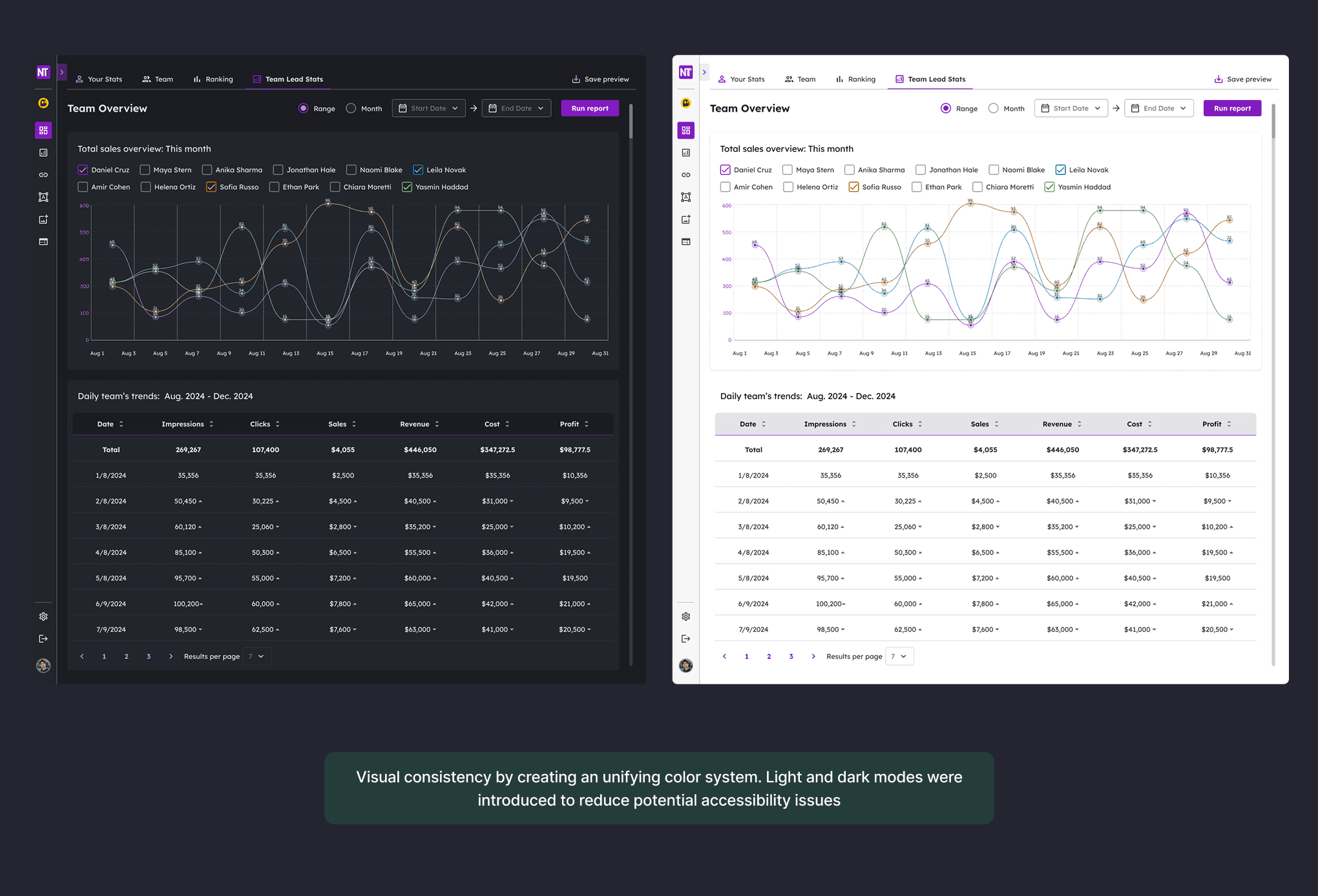
Visual inconsistency increased cognitive load
The original design used different brand colors for each team's interface (blue for ZenMate, teal for Intego, yellow for CyberGhost). This approach aimed to create tailored experiences but caused confusion when managers switched to a multi-brand model, as the interface changed appearance with each brand switch.
Implemented Solutions
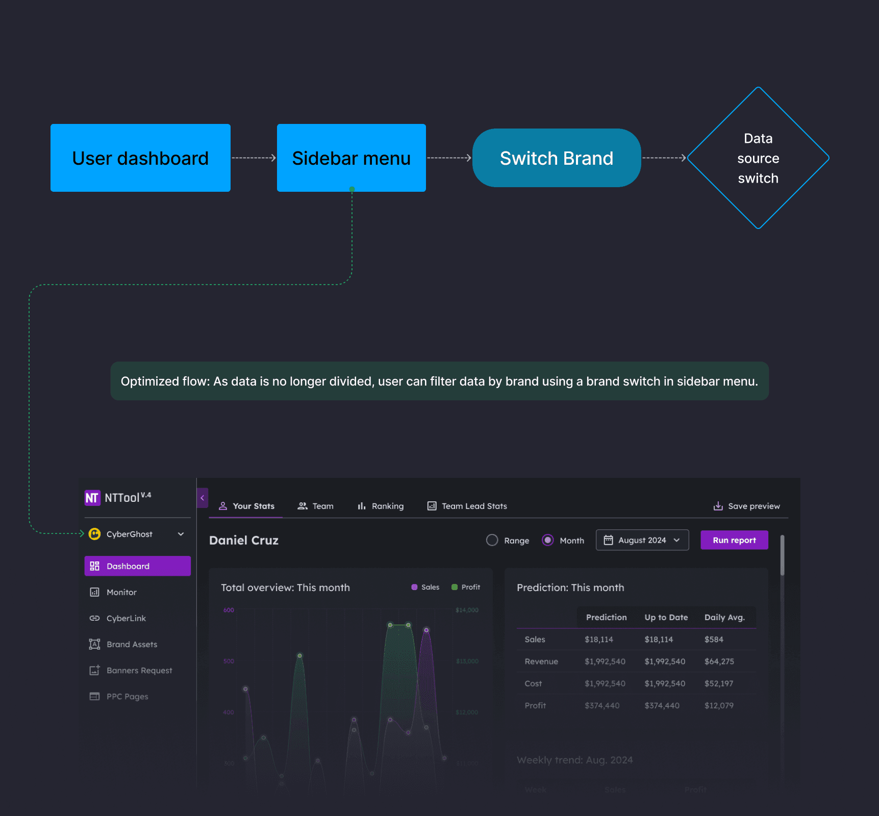
Brand switching without logout
Problem:
Managers lost time logging out and back in to switch between brands. The original flow forced a return to the login screen for every brand change.
Solution:
Unified login with an in-app brand filter. Users now log in once and switch data sources using a brand dropdown in the sidebar menu. Data remains separated by brand, but context switching happens instantly without re-authentication.
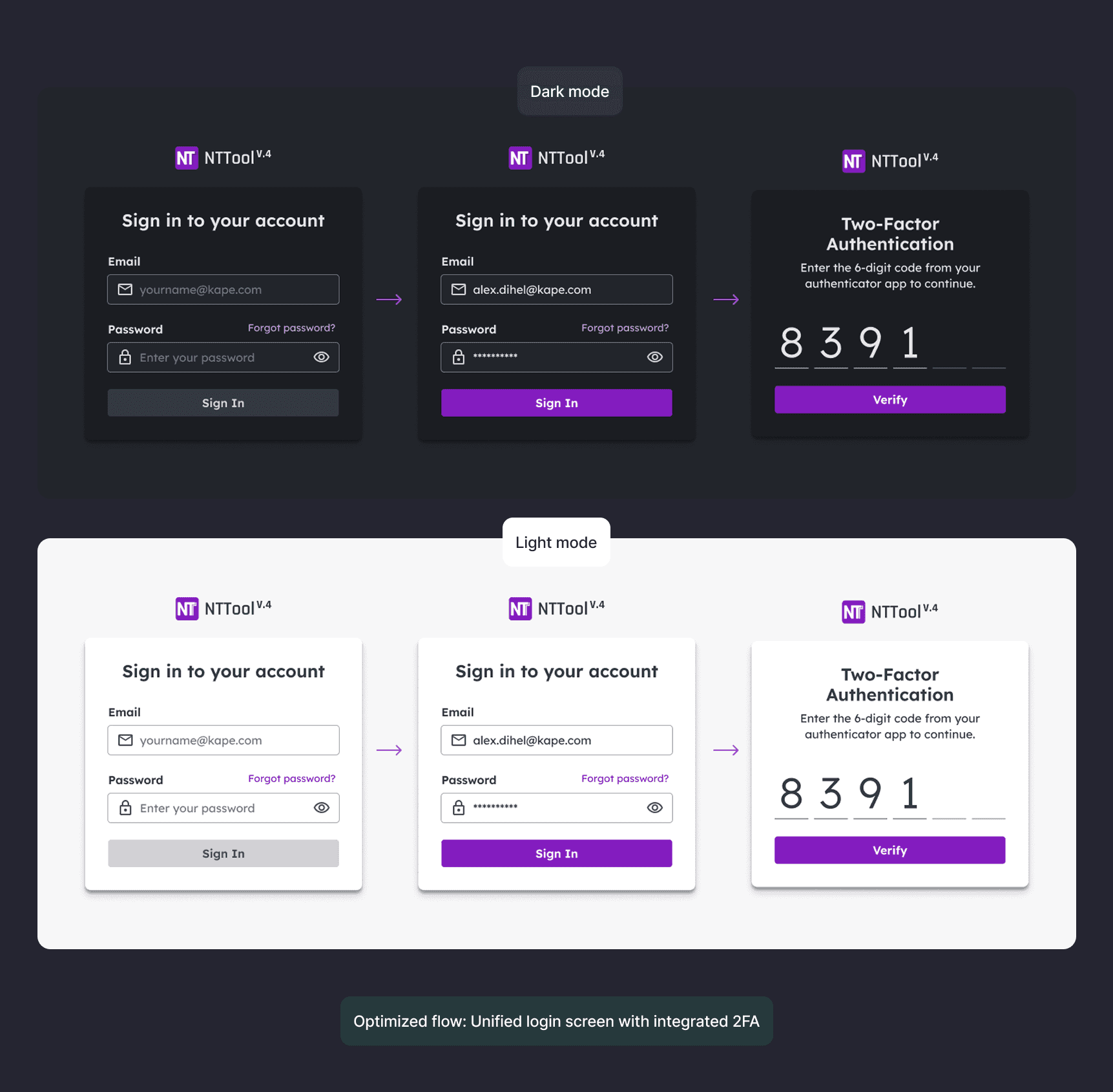
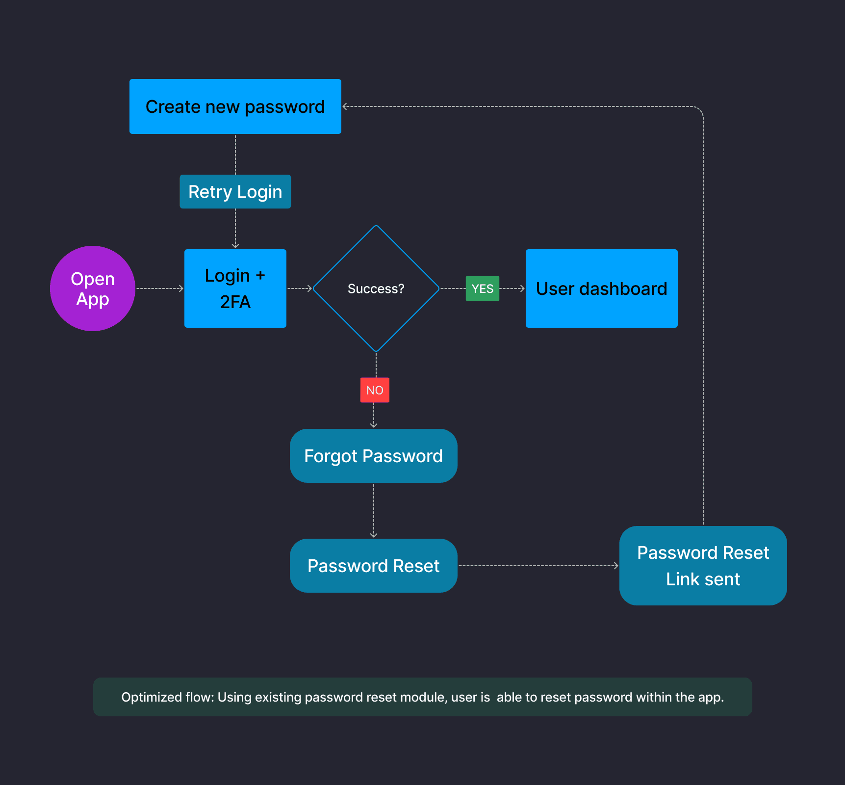
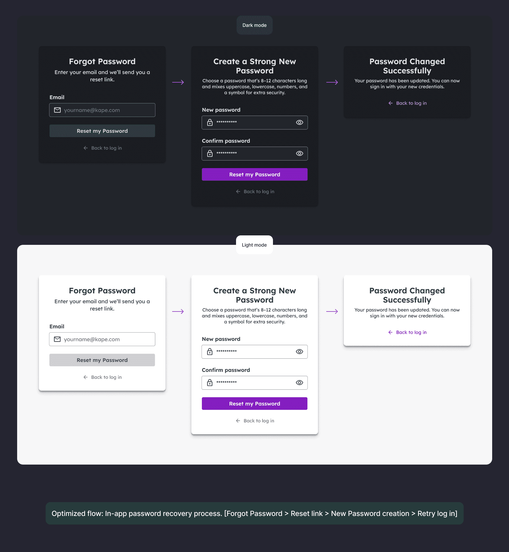
In-app password recovery with integrated 2FA
Problem:
Password resets required exiting the app, contacting IT via Slack, and waiting for manual intervention. This created delays and IT overhead.
Solution:
Built self-service password recovery into the login flow using an existing IT module. The new flow: Forgot Password > Reset link sent > Create new password > Retry login. Also integrated mandatory 2FA directly into the login sequence, meeting security requirements without adding extra steps. Both dark and light mode versions were designed for accessibility.
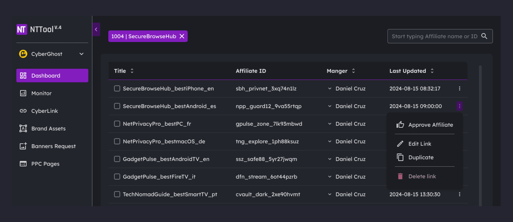
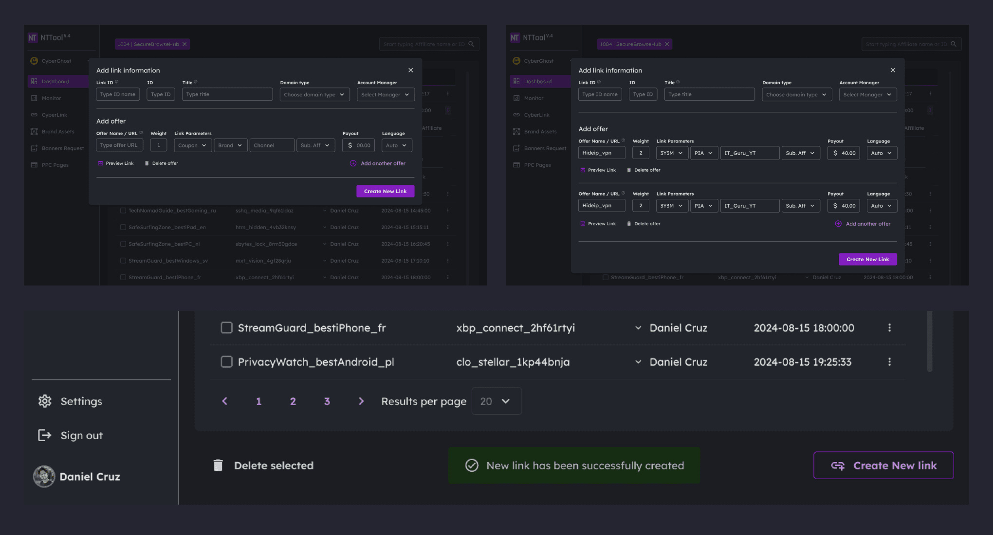
Clearer data presentation with sorting and bulk actions
Problem:
Cluttered data blocks with no filtering made it difficult to extract insights. Repetitive action elements increased error rates. No bulk edit functions were available.
Solution:
Introduced clearer hierarchy with improved typography and spacing. Added sortable columns, pagination controls, and search/filter functionality. Grouped row actions into a contextual menu (Approve Affiliate, Edit Link, Duplicate, Delete). Added bulk selection with checkboxes for multi-item operations.
Unified visual system
Problem:
Brand-specific color schemes (blue, teal, yellow) created visual inconsistency when managers worked across multiple brands. The interface changed appearance with each switch, increasing cognitive load.
Solution:
Created a unified color system applied across all brands. Introduced both dark and light modes to address accessibility needs and user preference. Dark mode was set as default based on 100% user preference in the team survey. The same visual language now applies regardless of which brand's data is being viewed.
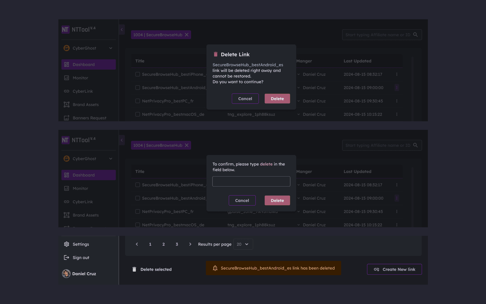
Two-step deletion and validation feedback
Problem:
New managers made errors when creating and editing affiliate links. Accidental deletions occurred without adequate confirmation.
Solution:
Introduced two-step deletion requiring users to type "delete" to confirm destructive actions. Added success notifications for completed actions ("New link has been successfully created," "Link has been deleted"). Clearer form labels and intuitive grouping of fields reduced errors in the creation flow.
Results
Operational improvements:
IT support tickets for password resets reduced by an estimated 80-85%, based on feedback from IT management
Brand switching no longer requires logout, eliminating repeated authentication
Landing page mapping errors dropped from roughly 15% to under 5%, based on team feedback
User experience improvements:
Onboarding time cut from 3 weeks to under 2 weeks
Positive usability feedback in team reviews
100% user preference for dark mode in team survey
Conclusion
The redesign resolved critical workflow and security issues while aligning the product with new operational needs. By streamlining login, adding self-service password recovery with integrated 2FA, reorganizing data presentation, and unifying the visual system, the tool became faster and easier to use.
The improvements reduced IT support overhead and made managers more effective in handling multi-brand operations. This project demonstrated how targeted UX changes in an internal B2B tool can directly support business operations by enabling teams to work with greater speed and fewer errors.
Alex Dihel | Product & Marketing Design Leader | Design Operations www.alexdihel.com © | Privacy
Alex Dihel | Product & Marketing Design Leader | Design Operations www.alexdihel.com © | Privacy
Alex Dihel | Product & Marketing Design Leader | Design Operations www.alexdihel.com © | Privacy