Reviewing EqualWeb Accessibility Widget
Reviewing EqualWeb Accessibility Widget
PRODUCT DESIGN
b2b2c
About the Equalweb Accessibility Widget
The Equalweb accessibility widget helps visitors adjust text size, colors and contrast, navigation, and screen reader behavior. It is used across public and private sites to support WCAG compliance and a more inclusive experience.

TL;DR
Goal:
Improve usability and clarity of the Equalweb accessibility widget, especially for vision-impaired and elderly users.
Issues:
Inconsistent visual aids, dense layouts, unclear feedback, hidden controls, no onboarding.
Modeled Results:
Higher feature success, faster interaction, fewer support issues, higher NPS.
Role:
UX/UI consultant and design lead - leading a full usability audit and competitive review.
Recommendations:
Standardize visuals, simplify layout, add clear feedback, clarify controls, guide first-time users.
Engagement and status:
Consultant proposal, Scope, multi-site review and WCAG checks. Status: proposal stage at the time of documentation.
Project Goal
This case study focuses on improving clarity and first-time success for the Equalweb widget, especially for low-vision and older users. A clearer widget reduces confusion, speeds setup, and supports client satisfaction. These improvements support broader business objectives. These include increasing client satisfaction, reducing user confusion, and strengthening Equalweb’s positioning in a growing and competitive market.
As new accessibility providers continue to emerge, refining the user experience helps Equalweb stay aligned with industry standards while standing out through clarity, reliability, and attention to detail. A better-designed widget not only improves compliance but also becomes a marketing asset for the company and its clients.
Research Approach
Hands-on testing of the widget across live websites, including Bosch Home Canada and EqualWeb's official site.
Comparative analysis of similar widgets (UserWay, AccessiBe, AudioEye) to assess layout, usability patterns, and pain points.
Accessibility audit using WCAG 2.1/2.2, covering contrast, keyboard use, screen reader support, and touch target safety.
End-to-end UX/UI evaluation, focused on first-time use, interaction clarity, and layout consistency across states.
Identified UX/UI Pain Points
To provide clearer insights, findings are divided into two categories:
Layout and Visual Structure, and Functionality and Interaction Feedback.
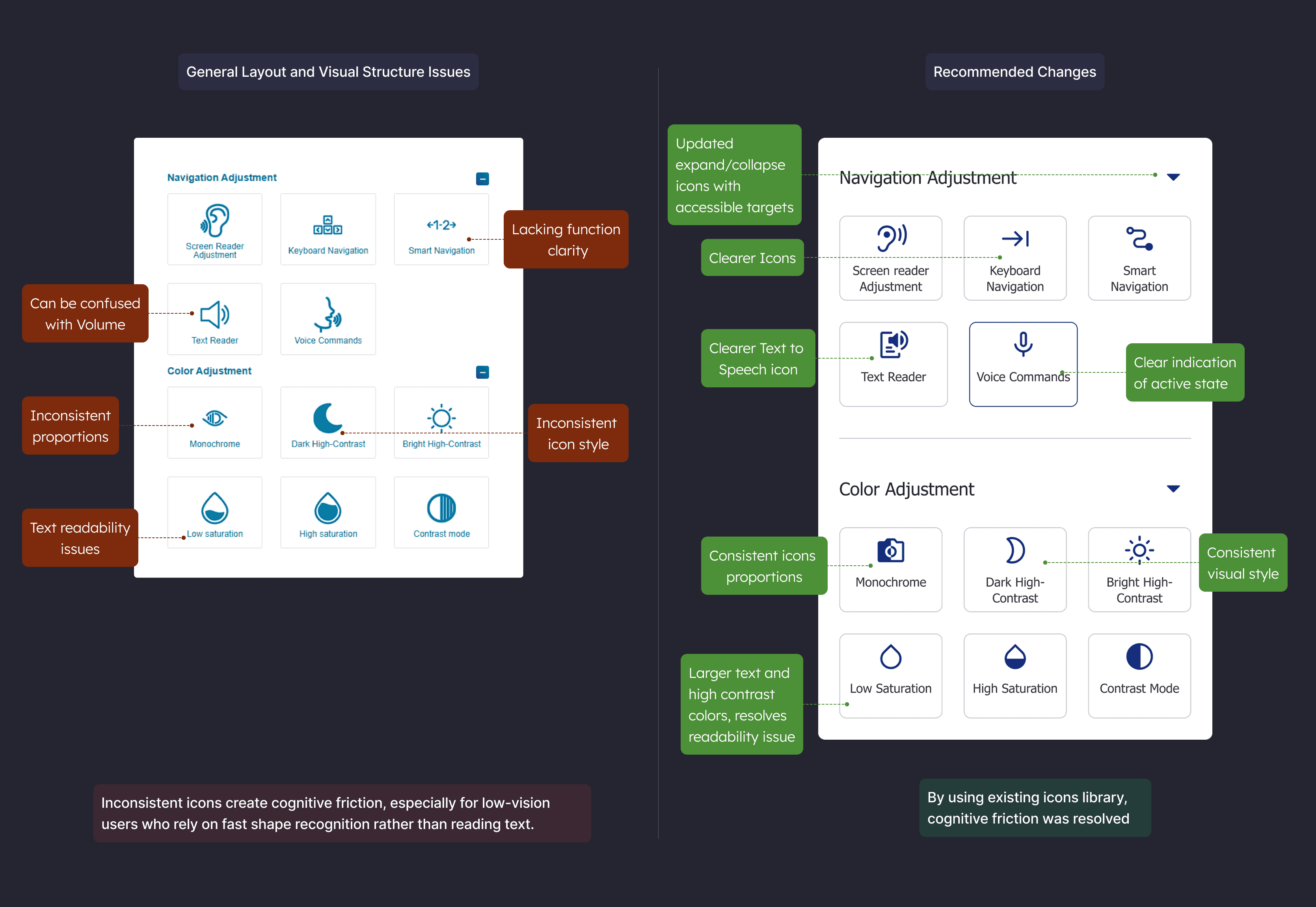
Layout and Visual Structure Issues
Inconsistent Iconography
The widget currently uses a mixture of outline and filled icons without a consistent visual logic. Some are bold, others are thin-lined, and their styles shift between categories.
Impact:
Inconsistent icons create cognitive friction, especially for low-vision users who rely on fast shape recognition rather than reading text.
Recommendation:
Establish a consistent visual system.
If outline and fill styles are used, they should serve a clear purpose such as inactive vs active states.
All icons should follow the same sizing, stroke weight, and alignment rules.
Design decision: use one icon style with explicit active/inactive states, trade-off, a small redesign for faster scanning.
To provide clearer insights, findings are divided into two categories:
Layout and Visual Structure, and Functionality and Interaction Feedback.
Layout and Visual Structure Issues
Inconsistent Iconography
The widget currently uses a mixture of outline and filled icons without a consistent visual logic. Some are bold, others are thin-lined, and their styles shift between categories.
Impact:
Inconsistent icons create cognitive friction, especially for low-vision users who rely on fast shape recognition rather than reading text.
Recommendation:
Establish a consistent visual system.
If outline and fill styles are used, they should serve a clear purpose such as inactive vs active states.
All icons should follow the same sizing, stroke weight, and alignment rules.
Design decision: use one icon style with explicit active/inactive states, trade-off, a small redesign for faster scanning.
Functionality and Interaction Feedback Issues
Partial and Inconsistent Action Feedback
Only some controls currently provide feedback when used. While contrast mode may show a checkmark and screen reader mode triggers a notification, other actions are silent.
Partial and Inconsistent Action Feedback
Only some controls currently provide feedback when used. While contrast mode may show a checkmark and screen reader mode triggers a notification, other actions are silent.
Partial and Inconsistent Action Feedback
Only some controls currently provide feedback when used. While contrast mode may show a checkmark and screen reader mode triggers a notification, other actions are silent.
Unclear Behavior of Logo and Accessibility Mode Toggle
Currently, clicking the widget's logo toggles a screen reader-related setting called "Accessibility Mode," but this is not visually clear. Logos are not typically used as functional elements.
Impact:
Users might click the logo thinking it is decorative or branding-related, not realizing they are enabling or disabling a critical function.
Recommendation:
Remove functionality from the logo entirely. Introduce a clearly labeled "Accessibility Mode" toggle switch at the top of the widget, making this behavior direct and understandable. Keep the branding on the footer and simplify the hero section.
Toggle label: ‘Accessibility mode’. Help text: ‘Optimizes navigation and screen reader behavior.’ SR description: ‘Accessibility mode, on, off.’
Misleading Representation of Hide Function
The crossed-eye icon used to hide the accessibility button resembles the close icon and can be misunderstood. The metaphor is too abstract for such an important control.
Impact:
Users may confuse the icon with either closing the widget or turning off accessibility features entirely.
Recommendation:
Replace the icon with a clearly labeled button that explains its purpose - Snooze function.
Position with buttons that have related functions: Stop Accessibility widget, Snooze Function and Close Widget
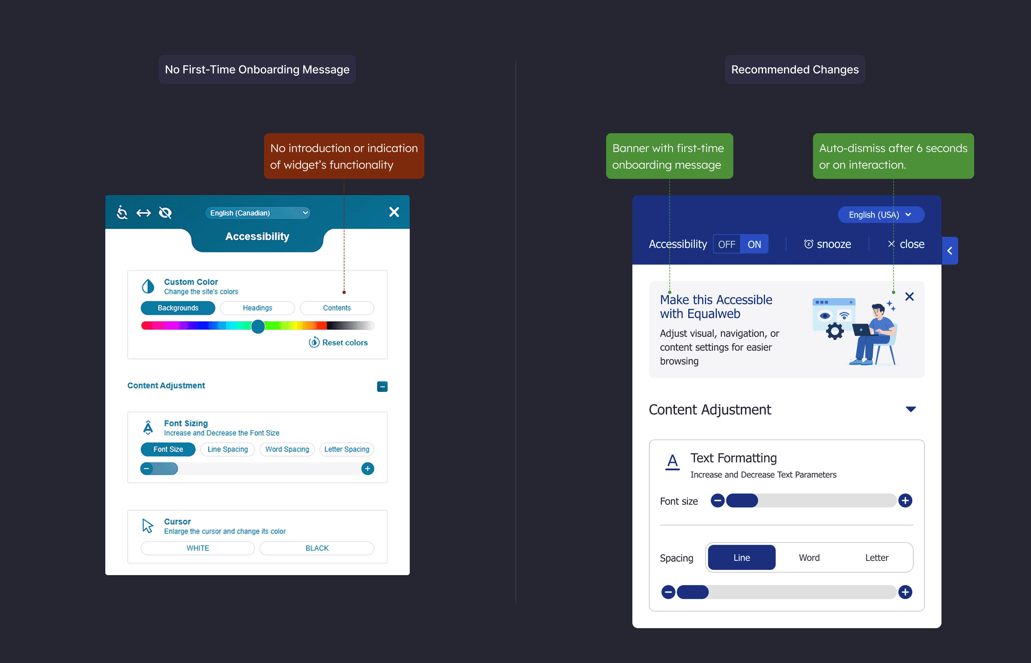
No First-Time Onboarding Message
The widget launches without any introduction or indication of what it is or how to use it.
Impact:
New users, especially those less familiar with digital tools or with cognitive challenges, may be unsure of what the widget does or how it helps.
Recommendation:
Introduce a brief onboarding banner at the top of the widget that reads: “Make this page easier to read. Adjust text size, colors, and navigation in one place. (Or alternative more marketing oriented message)
Auto-dismiss after 6 seconds or on interaction.
Measures:
Logo toggle fix → mis-activation rate down, time to find toggle down
Icon system unified → time to target down, wrong-tap rate down
Layout density reduced → task completion up, backtracks down
Standardized feedback → repeat actions within 5 seconds down
First-time banner → time to first action down, first-minute success up
Projected Results
Proposal stage, outcomes are modeled from the audit above and describe expected direction of change, not measured results.
If the UX and UI improvements recommended in this case study are implemented, the expected results would benefit both end users and business clients.
For End Users (Accessibility Tool Users):
Higher interaction success rate
Users find the right controls faster and complete actions with fewer missteps.
Faster time to first action
First-time visitors understand what to do sooner because labels and groups are clearer.Improved satisfaction scores
Interactions feel predictable and supportive, which lifts overall sentiment after use.More positive public reviews and testimonials
Clearer setup and feedback encourage more positive comments teams can reference.
For Business Clients (Website Owners Using Equalweb):
Improved brand perception through better accessibility
The widget feels integrated and considerate, reinforcing a brand that values access.Higher RFP win rate and competitive ranking
Cleaner UX and visible accessibility patterns strengthen side-by-side evaluations.Reduced support inquiries related to accessibility settings
Clear labels and consistent feedback reduce confusion-driven questions to support.More reusable marketing content
Teams gain clearer quotes and screenshots they can use in sales and case materials.
Conclusion
The Equalweb accessibility widget is a thoughtfully designed and technically sound tool. It supports a wide range of user needs and offers critical functionality for browsing with confidence.
What it lacks are refinements that would make it feel friendlier, clearer, easier to use, and better for product marketing.
These include:
Unifying its icon system
Improving layout density in key areas
Providing consistent, accessible feedback
Clarifying the purpose of top-level controls
Supporting new users with a short, helpful onboarding message
Accessibility tools must do more than comply with standards.
They must create a space where users feel in control of their experience. Small interaction and layout improvements can significantly increase the widget’s usability and help it fulfill its mission more fully.
Alex Dihel | Product & Marketing Design Leader | Design Operations www.alexdihel.com © | Privacy
Alex Dihel | Product & Marketing Design Leader | Design Operations www.alexdihel.com © | Privacy
Alex Dihel | Product & Marketing Design Leader | Design Operations www.alexdihel.com © | Privacy