About Kape Technologies
Kape Technologies is a cybersecurity and digital privacy company operating globally.
With a strong portfolio of products like ExpressVPN, CyberGhost, and PIA, the company has grown rapidly through acquisitions and technological innovation.
Kape’s own brand presence, however, remained relatively muted compared to its consumer-facing products. Kape’s corporate brand must stand on its own, not be overshadowed by ExpressVPN, CyberGhost, or PIA.

TL;DR
Goal: Refine Kape’s visual identity to improve professionalism, readability, and internal scalability.
Role: Senior Design Manager, single lead, ran a visual audit and proposed brand refinements.
Issues: Playful logo, low contrast, brand confusion with PIA, and slow illustration production.
Solutions: Simplify and rebalance logo, update typography, streamline illustration style, create reusable assets.
Projected Impact: stronger brand perception, improved legibility, faster asset delivery, and a clearer distinction from sub-brands.
Engagement and status: design-initiated proposal, presented with positive feedback; not implemented due to a shift in priorities.
Project Goal
The original rebrand modernized Kape, but it was not fully developed. The system lacked consistency, relevance, and scalability across touchpoints.
This proposal refines and rebalances the identity, preserving the core while improving legibility, professionalism, and brand equity.”
Research Approach
To establish direction, I conducted a comprehensive visual audit of the brand’s current identity. This included:
-
Analyzing how the logo functioned across digital and print media
-
Reviewing internal usage across presentations, documents, and stationery
-
Evaluating contrast and accessibility in real-world settings
-
Identifying typographic overlap with Kape’s flagship product, PIA
-
Benchmarking against cybersecurity and tech industry standards
-
Gathering informal feedback from internal design and marketing stakeholders to understand friction points in day-to-day use.
Identified Brand Pain Points and Recommendations
1. Over-emphasized Playfulness:
Issue: The current design excessively emphasizes playfulness, which diminishes our professional image.
Recommendation: move to a geometric, simplified, balanced style. Build compositions on a clear grid so the brand reads professional, not playful.
Decision note: we trade some whimsy for clarity and trust at first glance.
2. Non-Proportional Scaling:
Issue: There is a lack of clear relationship between the logo-mark and the word-mark.
Recommendation: Establish a hierarchy where the word-mark takes precedence, noticeably featuring the company name, while the icon serves a supportive, illustrative role. This restructuring will underscore the brand identity more effectively.
Reason: the name must carry recognition; the mark supports. Guardrail: set a fixed ratio and unit grid for consistent scaling.
3. Color scheme, Contrast and Readability:
Issue: The current design lacks sufficient contrast, particularly between the word-mark and other elements, affecting readability and impact.
Recommendation: Enhance the word-mark's prominence with a distinctive, high-contrast color scheme to improve visibility and readability.
Success condition: word-mark remains readable on light and dark backgrounds with clear separation from the symbol.
4. Typography:
Issue: The typography is too closely aligned with the PIA brand, which could confuse brand identity.
Recommendation: Recommendation: choose a distinct geometric sans-serif that complements the new style and separates Kape from PIA to avoid brand confusion.
Measures: brand recall and recognition uplift, reduced confusion with PIA, faster template production, and consistent internal usage.

Projected Results
Proposal stage, outcomes are modeled from the audit above and describe expected direction of change, not measured results.
Although the project remained in the proposal phase, the refreshed identity was designed to:
-
Improve brand clarity and trust across external channels
-
Create a more consistent experience for internal teams
-
Separate Kape from its consumer-facing brands more effectively
-
Reduce friction in producing branded materials
Conclusion
This identity refresh offered a practical evolution of Kape’s brand - one grounded in structure, usability, and consistency.
By keeping the brand’s original intent intact and addressing the key pain points through focused refinements, I delivered a system that supports Kape’s position as a serious player in cybersecurity and privacy.
The result is a visual identity that is clear, confident, and built to scale.
This proposal received positive internal feedback at presentation; it was not implemented due to a shift in company priorities.
Breakdown of Recommended Design Solutions
Kape Logo Design Update

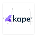
Geometric, Simplified, and Visually Balanced
The logo mark is built on symmetrical circles that honor the original while adding order and stability The new symbol is carefully crafted to project stability and professionalism, capturing the essence of our enhanced visual identity.

General Contrast and Readability
To address contrast and readability, we differentiate the name from the symbol effectively by employing scaling techniques and contrasting colors. This includes predefined color variations tailored for different environments, ensuring the brand remains distinct and legible in any context.

Scaling Issue
Scaling issue resolved by establishing a clear hierarchy between elements. A fixed ratio and unit grid keep the word-mark primary and the mark supportive, so the identity scales cleanly.

Brand Typography
The selection of the brand’s typography is the result of considerable research into industry trends and available styles. 'Lexend' offers high readability and a geometric feel that fits the proposed system, supporting a clear, balanced aesthetic.

Brand’s Illustrations Update
Impact: Current illustrations take specialist time and slow delivery. (on average 2-4 days), limiting utilization of non-illustrator team members.
Solution: update the illustration style and provide an editable library of scenes, so any designer can create consistent visuals quickly.
Status note: faster delivery is an expected outcome based on the library, not a measured result.

Visual Style Update Mockups
